Scientific Poster Layout and Design
Although most posters share the same components, there is no standard layout that must be followed and it’s up to you to lay your poster out in a way that makes logical and organizational sense. That being said, your venue, event, school, or organization may have guidelines to follow, so that’s a good place to start.
Size and Orientation
Again, there may be restrictions depending on how and where you are presenting your poster, but otherwise a great place to start is with a 48" x 36" poster in landscape orientation. This is the most common size poster we print.
Common Layouts
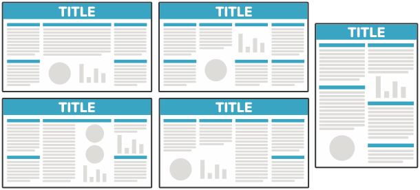
The general format of a scientific poster is to have a title section and 2-5 columns of information, divided into sections. If you’re not sure what sections to include, make sure to read about the parts of a scientific poster.
Use a layout that makes sense with the research you’re including, but here are some basic layouts that we see:
Design
When it comes to design, there are a few basic rules to follow:
- 1 Simple is good
- 2Make important information stand out
- 3Line things up
- 4Don’t make it crowded
These design rules can be followed for all design, but they are especially important for scientific posters where a lot of information needs to be fit into a small space. Here are guidelines for specific aspects of your design:
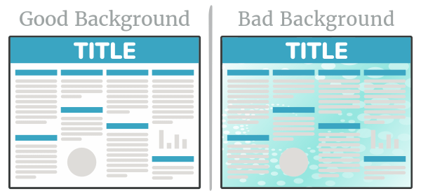
Background
Keep your background non-distracting. We recommend you keep the background white or some other light color, with a subtle gradient as an option. You should avoid photos, busy patterns, or distracting colors, as it will take away from your content. If you are going to use a darker color, make sure your text is white to keep it readable.
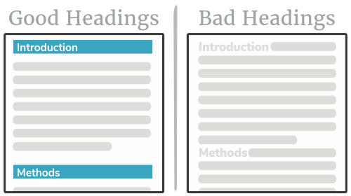
Title and Heading Styles
At a quick glance, a viewer should be able to easily identify each section of your poster. A great way to accomplish this is by clearly defining each section with a heading that stands out. Using colors, boxes, bold text, and lots of whitespace are all good ways to make sure your section heading stands out.
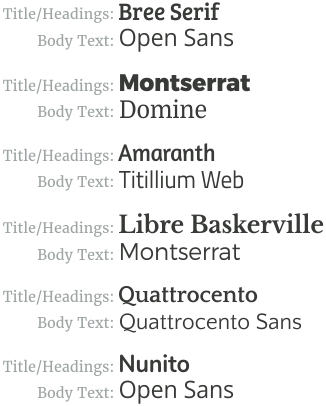
Fonts
The primary rule with fonts for your poster is to make sure they are easy to read. Beyond that, it’s up to your personal taste. A good design principle to follow is to use one font for titles and headings and another for the rest of your text. Although you may already have some good fonts on your computer, Google Fonts has a constantly-increasing collection of high quality free fonts. Here are some good font combinations to get you started:
Font Size
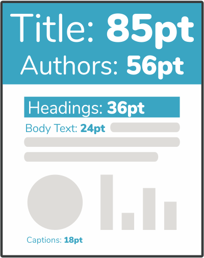
Make sure that all the text on your poster can be read from a normal distance. The graphic below shows the font sizes we recommend using for different components of your poster. This will allow your poster to be read from about a 4 foot distance, but you can increase the sizes if you anticipate the reader standing farther away. In addition to this, we recommend setting the line spacing your text between 1.25 and 1.5.
Colors
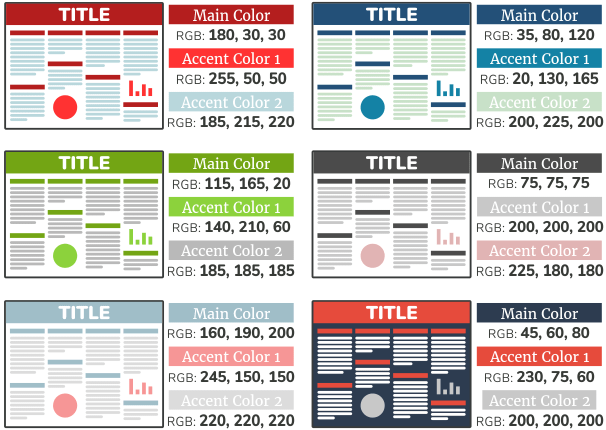
Using color is a very important aspect of poster design. Colors should capture attention and highlight important information but should not be distracting to the viewer. It’s generally a safe bet to use the colors associated with your school or organization, but this is typically not a requirement. If you are going to pick your own colors, we recommend keeping them rather neutral with perhaps one bolder color used sparingly. Here are some simple color schemes to get you started:
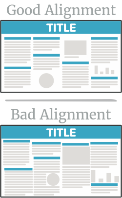
Alignment and Whitespace
An easy way to make sure your poster looks very professional is to keep things well-aligned. Imagine a grid on top of your presentation and if two things are close to the same gridline, make sure they are exactly aligned. Also, if you have a set of charts or images, try making them all the exact same size and have them evenly distributed.
A final layout design tip is to make sure there is enough space between each unique element in your design, as well as enough space around the border of your poster. If two sections of text are nearly touching, it will be hard for the viewer to see where one ends and the other begins. Although it may be a bit counter-intuitive, more space around an element of your poster will draw attention to it and therefore give it importance. If one piece of data is the highlight of your research, do not crowd it amongst other less-important data.
Questions, Comments, or Concerns
If you have any further questions or comments about our tutorials, we would love to help you out.